Q: What do scientists do when they have lots of data but no theory?
A: They make graphs.
As an example of what graphs can tell us, let's look at people. People have many defining characteristics, not all of which are related. So, we can plot properties of people and see what the plots look like. For example,
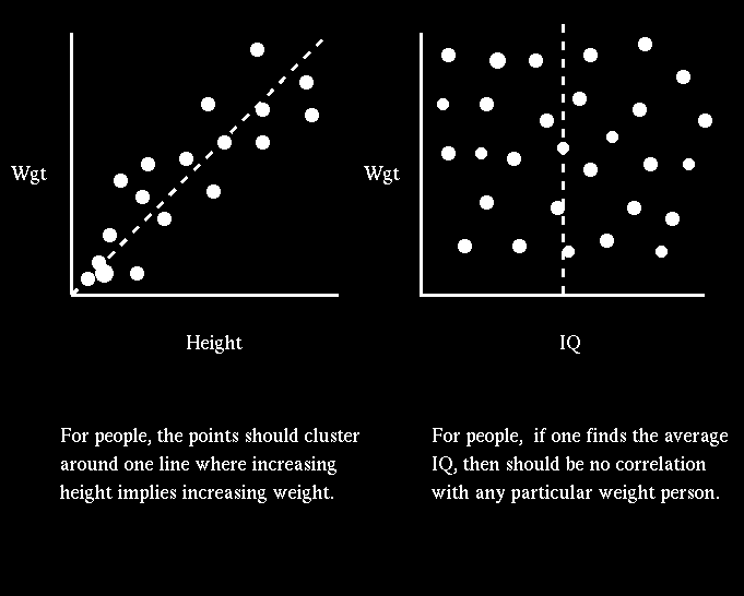
The plot of weight versus IQ is a scatter diagram. That is, a person who weighs 150 lbs can either have a high or low IQ, while a person who weighs 300 lbs can either have a high or low IQ. The weight of a person is not a good predictor of IQ, that is, there isn't a physical relationship between weight and IQ.
The plot of weight versus height for a sample of people, however, shows a well-defined (albeit noisy) relationship in the sense that the taller you are, the more you are likely to weigh. This correlation suggests something about the structure of a person in that the weight and height are connected.
From this simple exercise we learned something important about people. We did not learn how people are put together, but we did learn that there is a correlation between height and weight. It is up to the theorists to explain why height and weight are related in the manner that they are.
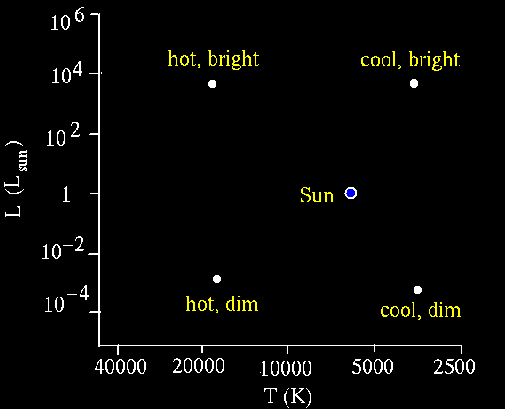
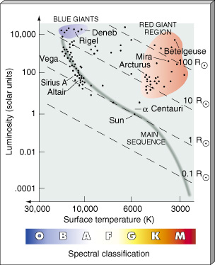
For astronomers, a big step forward in understanding stars came in the early 1900's when Ejnar Herstzprung and Henry Norris Russell independently made the discovery that the luminosity of a star is related to its surface temperature. (They actually used a quantity known as the Magnitude of the star and the Spectral Class of the star.) This result is amazing. A schematic Hertzsprung-Russell diagram is shown below:

Hertzsprung and Russell both used the spectral class (which is related to the temperature) in their plots. They ordered the stars as O, B, A, F, G, K, and M. Since the O stars are the hottest, this means that in the HR diagram, the temperature axis is odd in that the temperature decreases as one moves to the right.
When luminosity versus temprature plots are mode, stars do not fall randomly on the graph; rather they are confined to specific regions. This tells you that there is some physical relationship between the the luminosity and temperature of a star.
What are some other things we can deduce from the HR diagram?