The data reduction of UV data is roughly made of two main steps: reduction
of UV files, output of which are dirty maps, and reductions of dirty maps,
which contain a big amount of noise which results from diffraction and sidelobes of antennas. Making dirty maps is fairly easy ( at least judging from what *I* know).
For that(and all the other things) we use the software called AIPS, which is written on Fortran. There is a bunch of commands which can be used in order to make dirty maps--horus, mx, etc. Here is the dirty map of 3c397 in C band.
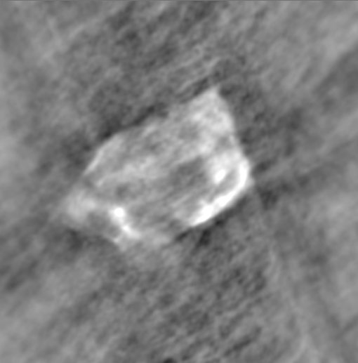
In order to be precise I have to say that this is the map of Intensity(which
is represented by Stoke's I parameter).
The next step of the reduction is the cleaning of our map. For that we can
use mx, clean, or other "subprograms." However, before begining to cleanse the map, we have to figure out how much of noise is over there, in order not to "overclean" the map, erasing some parts of possible sources. Thus, before passing to this step, we have to do some preliminary data inspection, which will result in us knowing how much of noise is there in the data. The following picture is
the Intensity vs. #pixels plot for a rectangle in the previous dirty map. The recangle was chosen so that the obvious part of the source is not included in it.
The plot(called histogram) shows how many pixels of a particular intensity are
there in the box.

As you can see, here we have a Gaussian centered at zero. This is exactly what we should expect to see for a territory filled with random and chaotic values. Thus, the box was accutaly filled with noise.
As we can see, there is a huge amount of noise in this map. To see better where does this amount of dirt comes from,
here is the immage of the synthesized beam of the whole VLA.
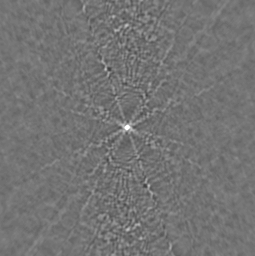
The ideal case would be a dot in the middle of the picture. However, because
of diffraction effects(which constitute the sidelobes of the antenas), we rather have a dot with lines that pass through it. Another way to understand this
map(at least as much as I understood it) is to say that it is what the observer on the supernova sees when he looks on the antena array. Here is the plot of
the intensity vs. distance for a line which passes through the middle of our beam.
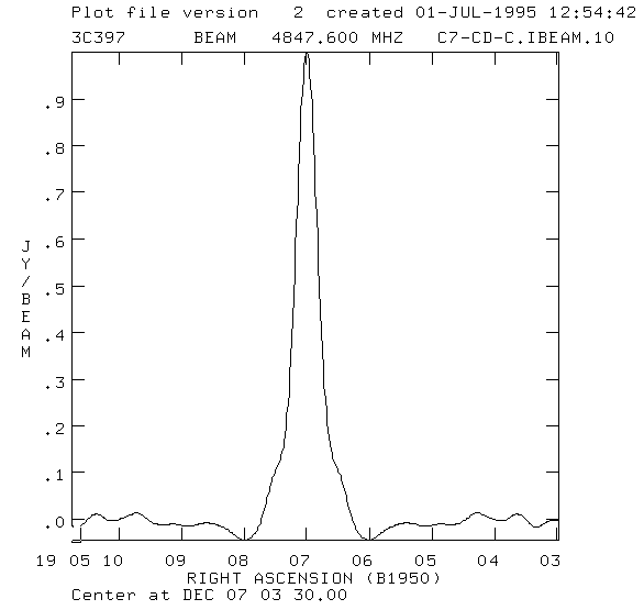
This reminds me the intensity pattern of a single source...or rather a source made of very closely spaced little sources(however, I still need to make sure
that this way of understanding is correct, so have patience).
As already said, before cleaning the map, we first need to find an idea about the
noise, and also it would be usefull to have some ideas about the sky coverage of the array. Here is the plot of Intensity vs. the baseline for different
pairs of antenas. The baseline is measured in wavelengths, and is the distance
between the lines of vews of the two antenas(which make the pair, and there
are actually more than 300 pairs). As we see, bigger the baseline is, smaller is the intensity.


Here is the cleaned(with MX) radio immage of 3c397 in L band. As you can
see, it still has some noise, which, however, is greately reduced.
